Web, Brand, Ads & Tools / Case Study
The Ledge
A 501(c)(3) community gathering hall: the website, the brand, and the ongoing work that keeps both running.
A community rises from a strong foundation. As the hands behind the digital strategy and creative direction at The Ledge, Devin and Oakley have shaped this identity from the first sketch to the final line of code, starting with a feather to symbolize the collective strength required for flight. Just as it takes many feathers working in harmony to lift off, we built a digital presence designed to bring people together. From the initial brand strategy and logo design to a living, breathing website that mirrors their active calendar, we ensure their mission has the wind it needs to soar.
This one runs a little different from most of the work on this site. What started as contract design work grew into an in-house role. Devin and Oakley both work at The Ledge directly now. That access is closer to a Brand Guardian arrangement than a typical client relationship: full run of the brand assets, the style decisions already settled, and no back-and-forth needed to keep something on-brand.
The website
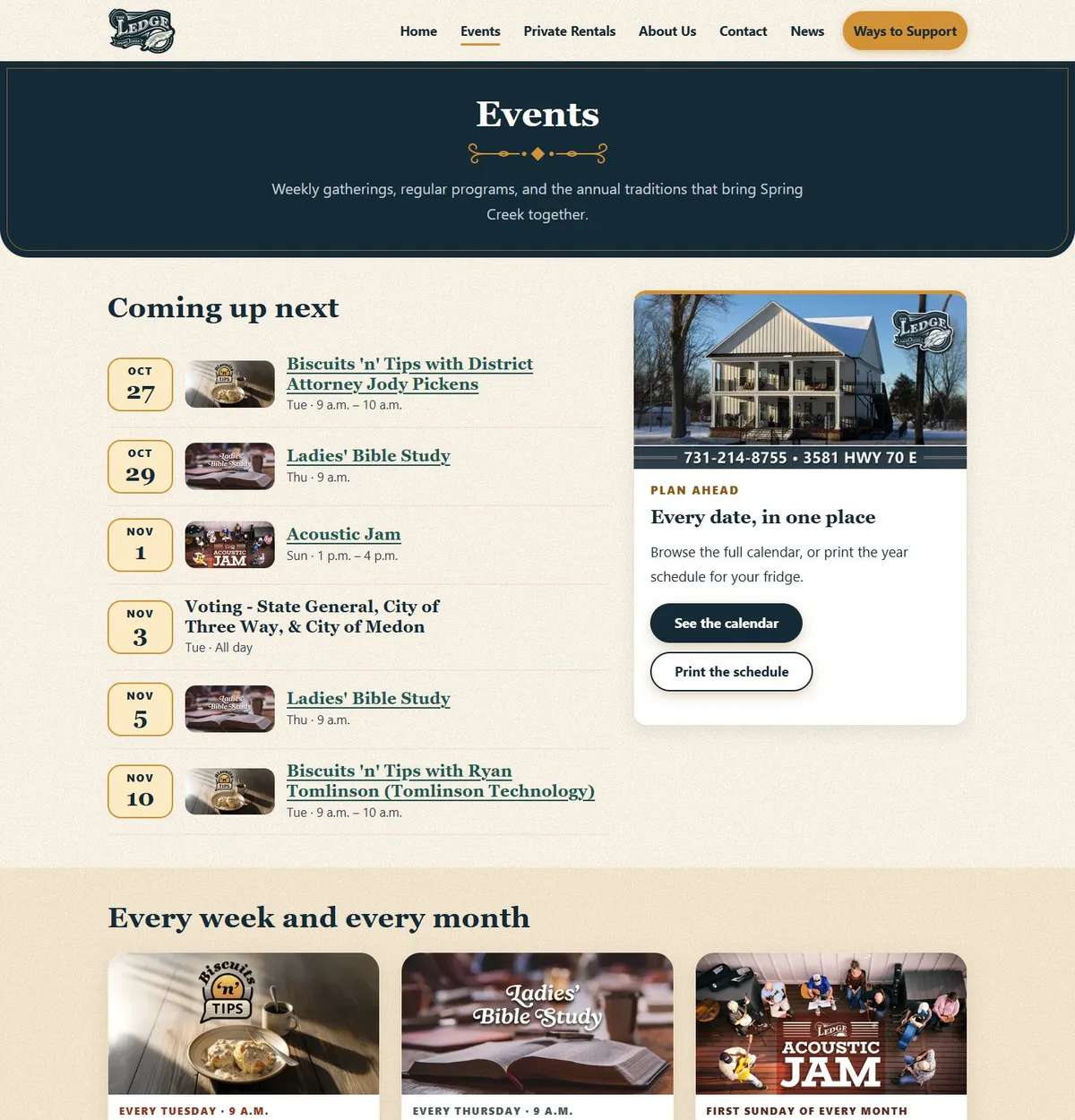
In October 2026 The Ledge’s website was rebuilt from a heavy WordPress install into a static site: no database and no plugins to keep patched. It keeps the hall’s warm, vintage character, and it puts the next event where nobody can miss it. Many of the people who use it are older, so type is large, tap targets are generous, and nothing hides behind a menu.
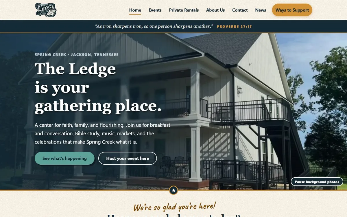
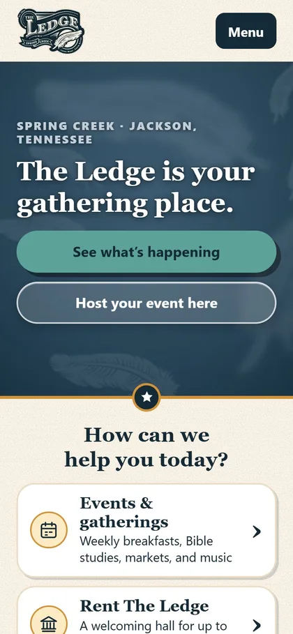
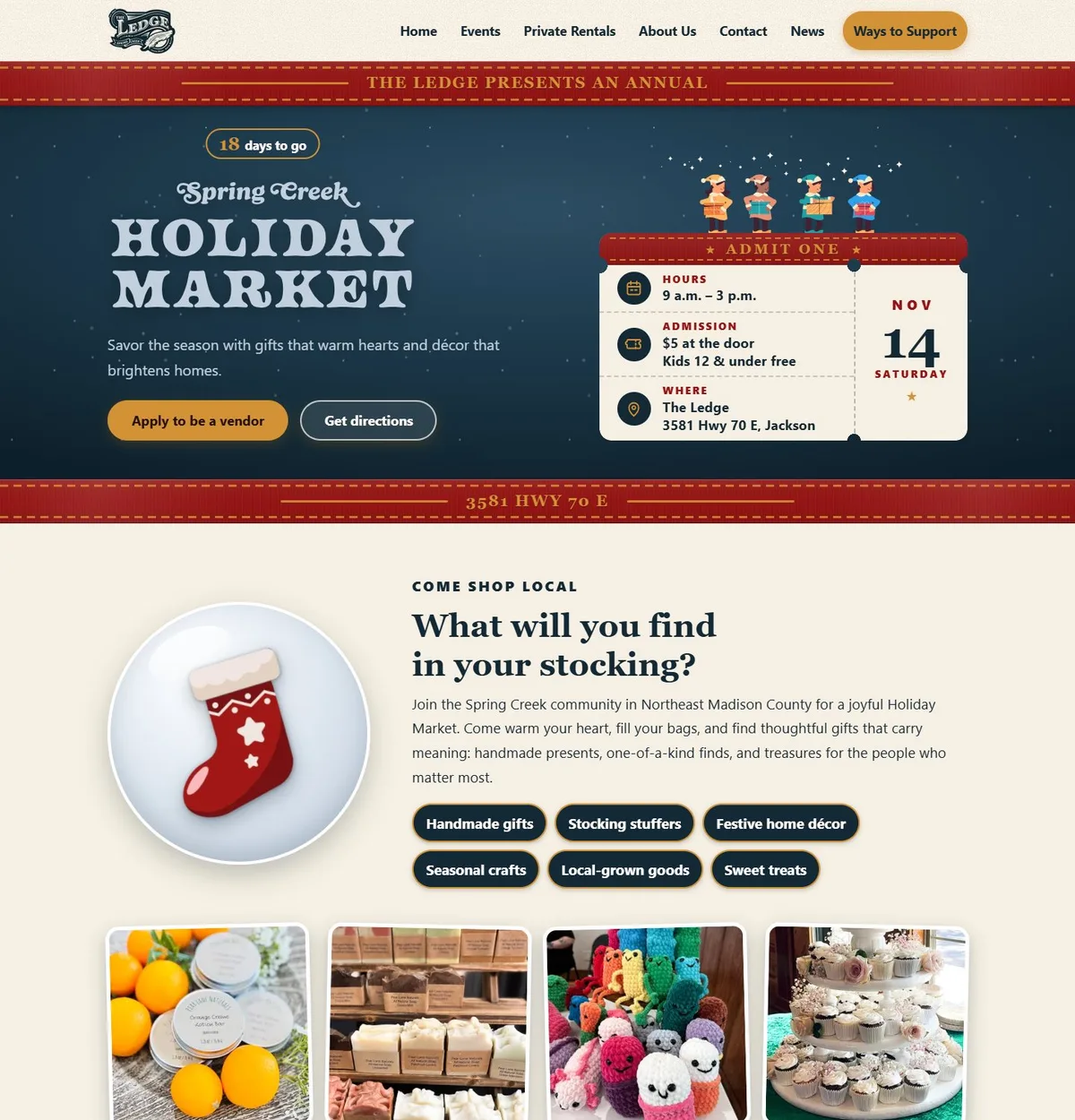
Each annual event gets its own themed page, built from the same system: the Holiday Market, the Craft Market, the Hwy 70 Yard Sale and more. Weekly programs pick their next date automatically, annual events show their date or “To be announced”, and visitors can see what is coming up next. Sponsorship and giving pages, a full rental inquiry form and a news section with photo galleries are part of the same build. Every old WordPress address was redirected, so links people had saved still work.
The Holiday Market ads
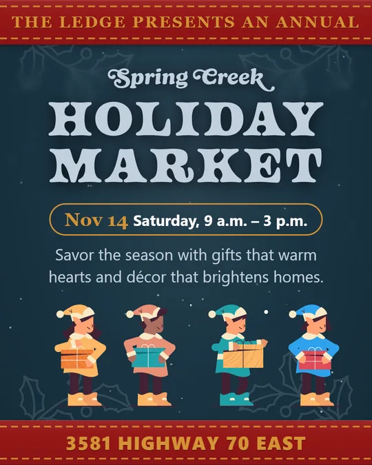
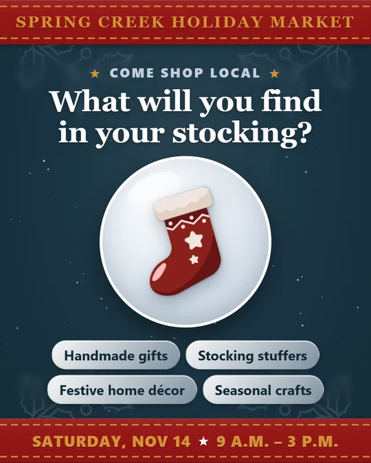
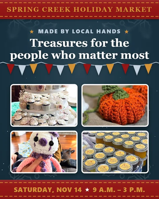
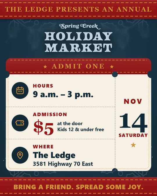
For the Spring Creek Holiday Market on November 14, a four-card Meta campaign was designed straight from the event page, so the ads and the website read as one brand. Each card has one job: when and where, what you might find, who makes it, and what to bring. They are sized 4:5 to take the most room in a phone feed, and the setup was kept simple so it passes ad review.
The mark
The Ledge’s logo started with a feather: the collective strength it takes for many to lift off together, which is exactly what a community hall asks of the people who use it.
The logo process
This project documents the logo design process for a local community cornerstone: The Ledge.
Located in the heart of the Spring Creek community in Jackson, Tennessee, The Ledge is a non-profit gathering hall for faith, family, and flourishing. The goal was to capture that spirit of “elevation” and translate it into a symbol that feels timeless.
1. Surveying the Site: Understanding the Role
Every effective logo design process begins with listening. Before a pencil was touched, time was spent with the staff to understand their “Four E’s”: Education, Enrichment, Entertainment, and Events.
The design needed to bridge the gap between rural history and future growth, anchored in five core values: Faith, Family, Community, Preservation, and Growth. Not just a checklist; the mortar that held every creative decision together.
2. The First Cut: Sketching & Symbol Exploration
There’s a friction to lead on paper that’s worth trusting. This stage is intentionally raw: sketching lets ideas breathe before the rigid lines of software take over. Abstract shapes and literal emblems both got explored.
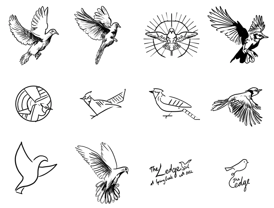
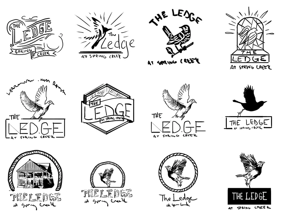
Many ideas were left on the cutting room floor, searching for a symbol that could represent an individual’s leap of faith and the collective strength of a community.
3. Selecting the Grain: Typography Direction
A logo’s “voice” is found in its type. For The Ledge, the letters needed to be sturdy enough to be read from a passing truck on Highway 70, yet warm enough to welcome a neighbor.
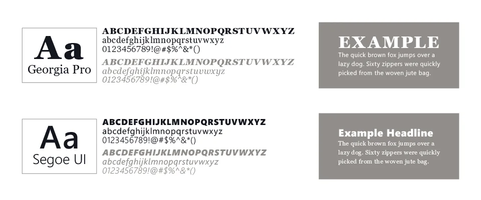
Georgia Pro is a transitional serif, sitting right at the hinge between old-style and modern type, and it could have plausibly appeared on a real sign from the early 1900s without straining the reference. That contrast between old-world serif and clean sans-serif mirrors the mission of The Ledge: honoring the past while equipping the next generation.
4. Digital Refinement & The Feather
As the work moved into the digital workshop, the logo shifted toward a “vintage-artisan” aesthetic. A literal dove gave way to the feather.
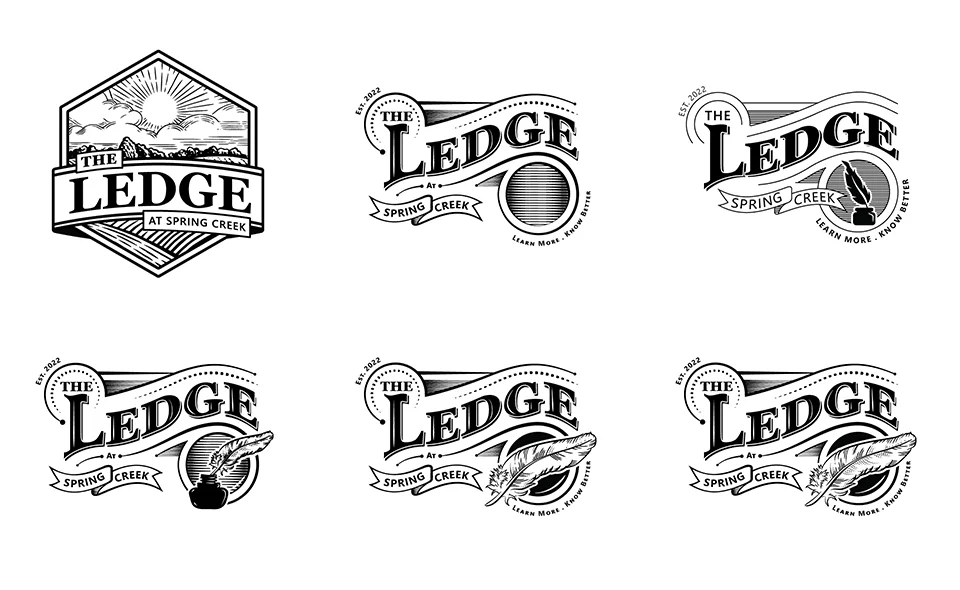
A feather is a tool for writing and a miracle of engineering. Alone, it is delicate; together, feathers grant the power of flight. That became the central metaphor for Spring Creek: individuals coming together to help the community take flight. The curves and tension of the feather were refined until it felt intentional and balanced.
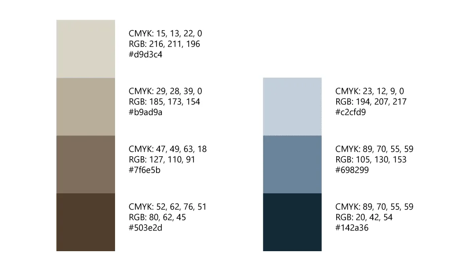
5. Applying the Finish: Color Exploration
Color should never be used to hide a weak design. The mark was perfected in black and white first, to make sure it would work on everything from heavy-duty signage to a simple tax-deductible receipt.
6. The Final Mark: Built for Every Use
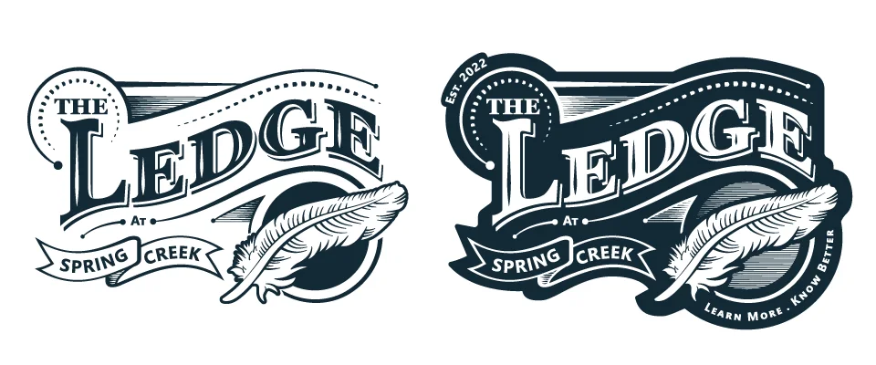
A good tool must be versatile. Because the primary mark leans into a detailed vintage style with banners and flourishes, a simplified version was built alongside it.
In the logo design process, functionality is king. This secondary mark ensures that whether The Ledge is screen-printing t-shirts or engraving a small wooden plaque, the brand remains clear, legible, and proud.

Why This Process Matters
Design is simply structured problem-solving. Showing the process is a way of demonstrating that a brand isn’t the result of guesswork. It’s the result of craftsmanship. If you’re building something meant to last, the foundation matters most.
The logo, animated
The Ledge’s clean modern mark draws itself in line by line and then fills solid, built in plain JavaScript and CSS with no video file and no animation library. It runs as a widescreen loop that works as a screensaver or a video background.
A donation bucket label tool
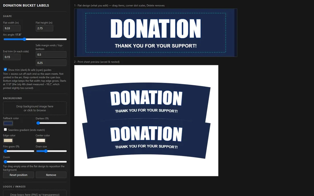
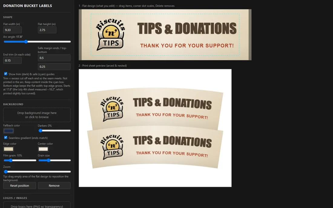
Donation buckets at The Ledge are cone-shaped, so a label has to be drawn flat and print as an arc that meets cleanly at the seam. This browser tool lets staff design the label flat, shows how it wraps around the bucket from its measurements, marks the trim and safe zones, and lays two labels out on one print sheet. It turns a geometry job into a few minutes of work.
Ongoing: the Hwy 70 Yard Sale
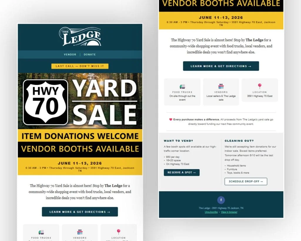
The Highway 70 Yard Sale is an annual community-wide event The Ledge hosts every year. It needs the same thing on a deadline every time: an email that gets the dates, the location, and the vendor and donation details in front of The Ledge’s full mailing list without looking thrown together at the last minute.
Built for Mailchimp, sized for a mobile inbox first. The Ledge’s wordmark, colors, and type sit at the top exactly like they do everywhere else the brand shows up. The yard sale sign art is the only thing that changes season to season.
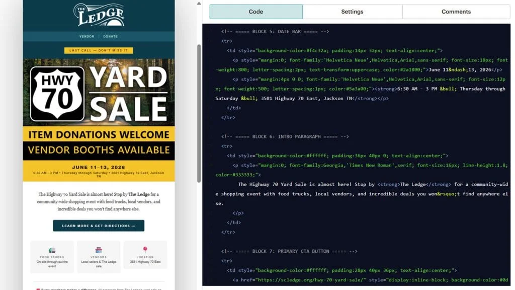
Oakley builds these directly in Mailchimp’s custom code block rather than the drag-and-drop editor: hand-written HTML tables, commented by section, so next year’s version is a quick edit instead of a rebuild. The styles and asset library Devin and Oakley maintain together get pasted straight in, block by labeled block.
What held it together
The same brand system that governs The Ledge’s website and print work governs its inbox too: same colors, same type, same voice. That consistency is easier to hold onto when the person writing the email and the person who built the brand are working from the same shared library, not handing files back and forth between agency and client.
Want the Same for Your Business?
This one build touched three services: Web Design, Branding, and Marketing. Start wherever your business actually needs it. See All Services >